Triton Ring Maker Kiosk
CLIENT
![]()
ABOUT
Frederick Goldman (FGI) was founded in the late 1940s as a one-person operation specializing in plain wedding rings. FGI has grown to become one of the largest jewelry manufacturing companies in North America across three separate divisions serving all retail channels of distribution.
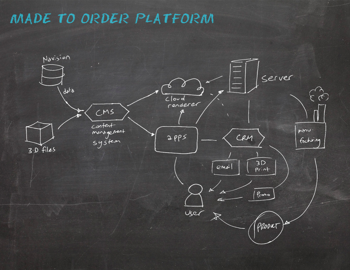
Modstar was brought in to develop the strategy, features, implementation, and design of FGI’s ring customization application.
CHALLENGE
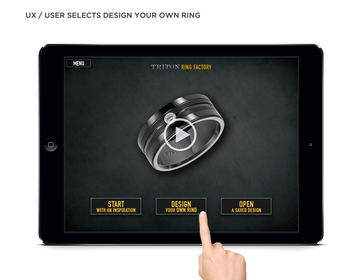
Create a bespoke ring design portable kiosk for use in FGI’s partner jewelry stores.
SOLUTION
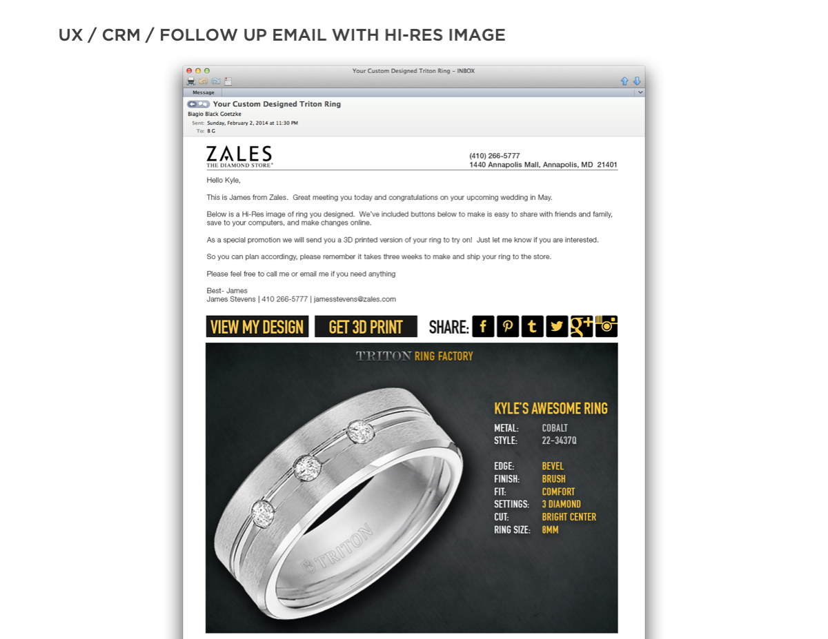
We started by researching the business opportunity. In a recent survey, nearly three-quarters of consumers claimed to want personalized products and services. This study concluded that the so-called “I designed it myself’’ effect increases a customer’s sense of ownership and connection. There was a clear business case for empowering the consumer with a bespoke ring designer. In addition, a customization platform provides valuable market and customer data, CRM opportunities, and offers customers positive and shareable experiences.
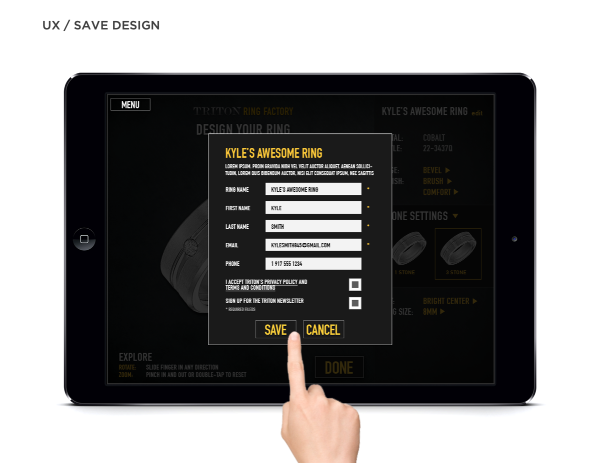
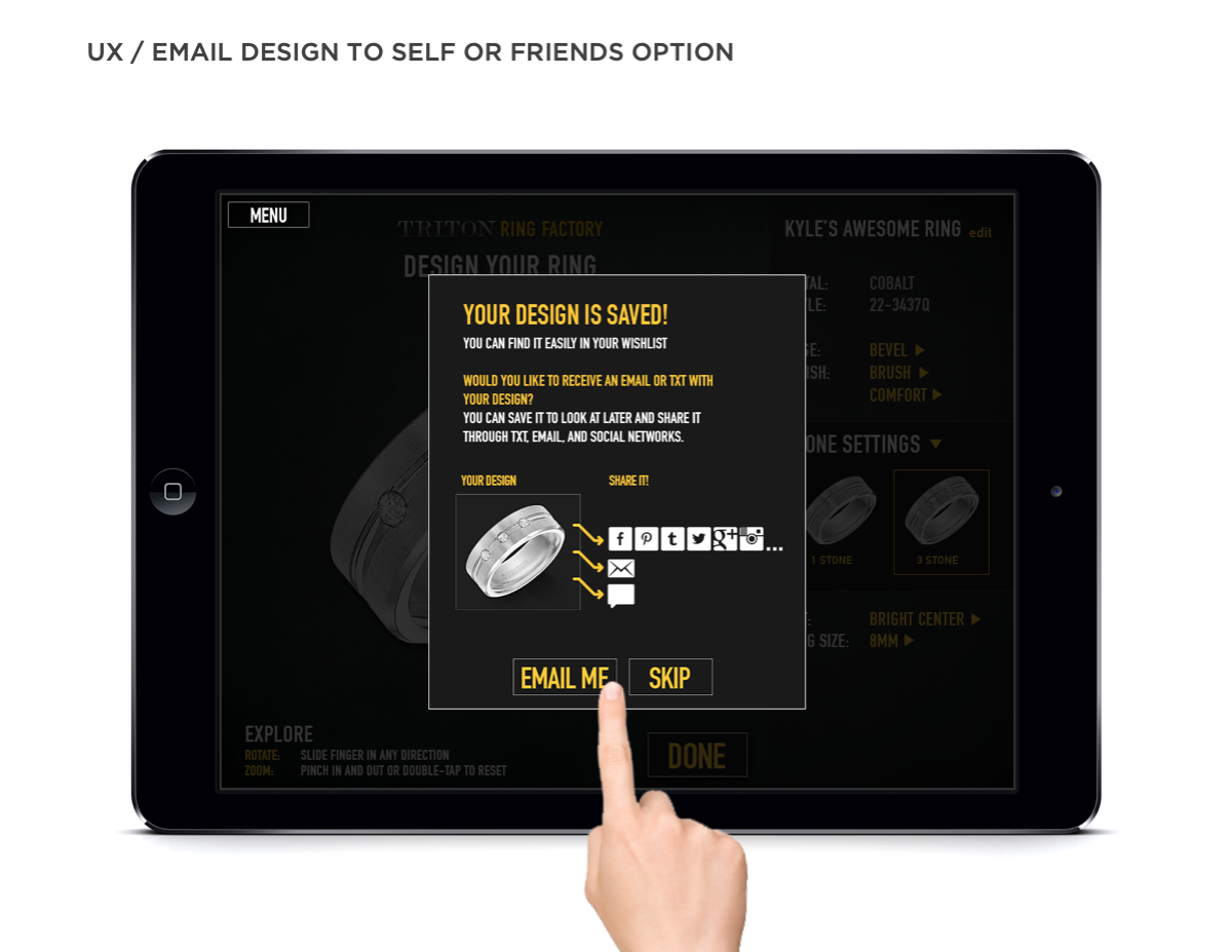
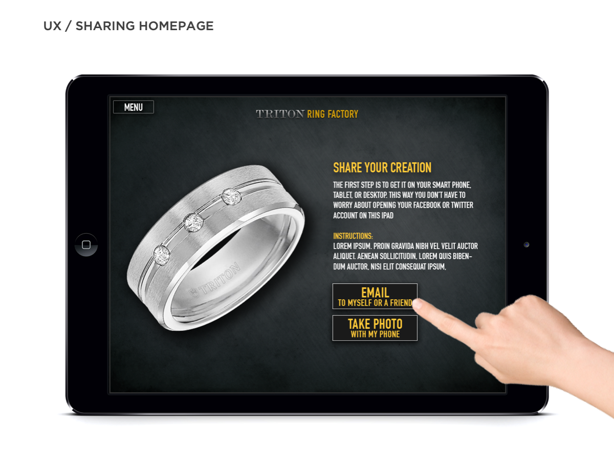
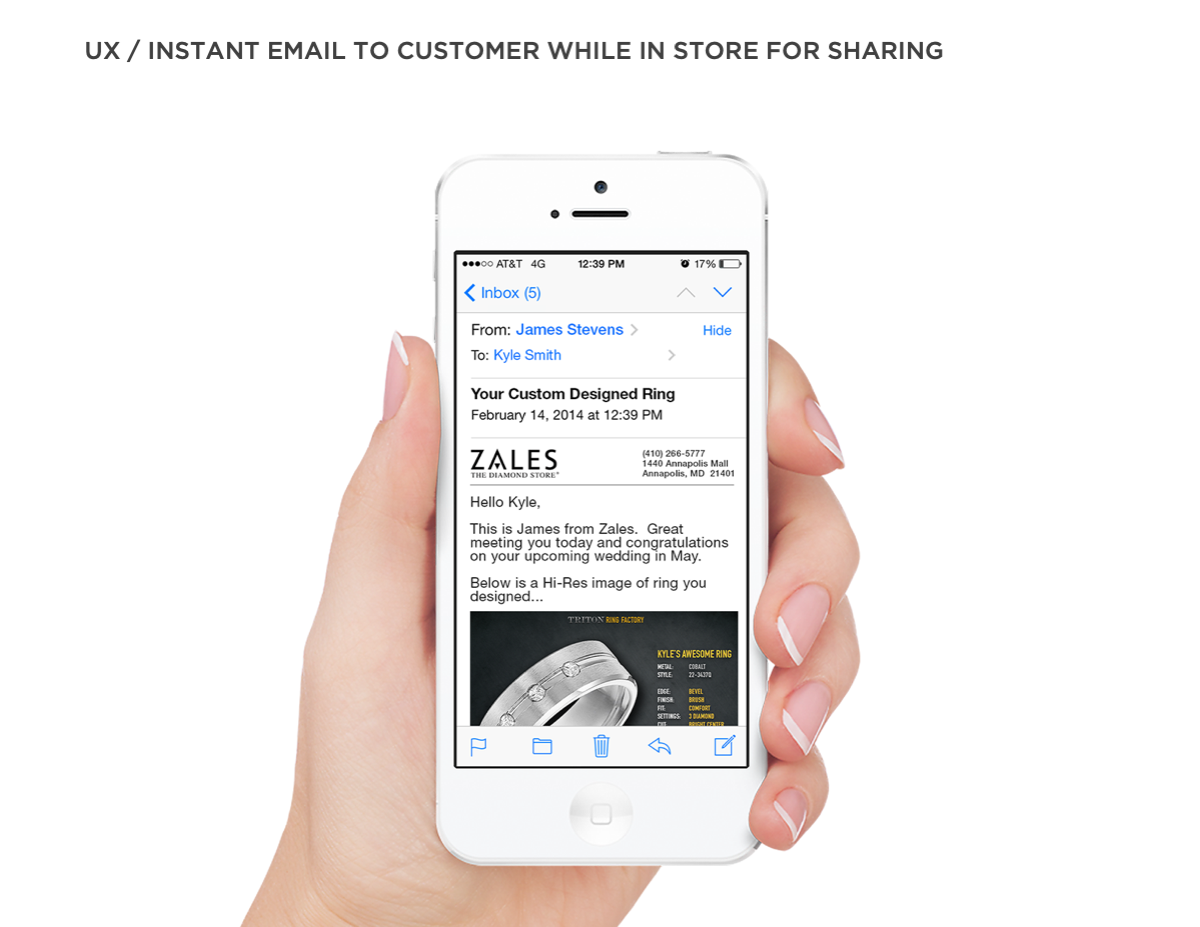
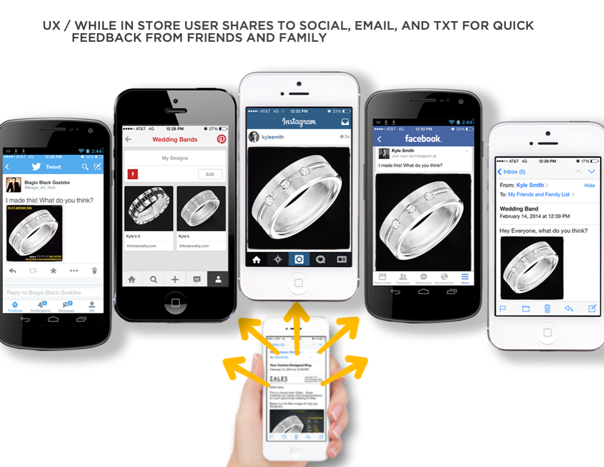
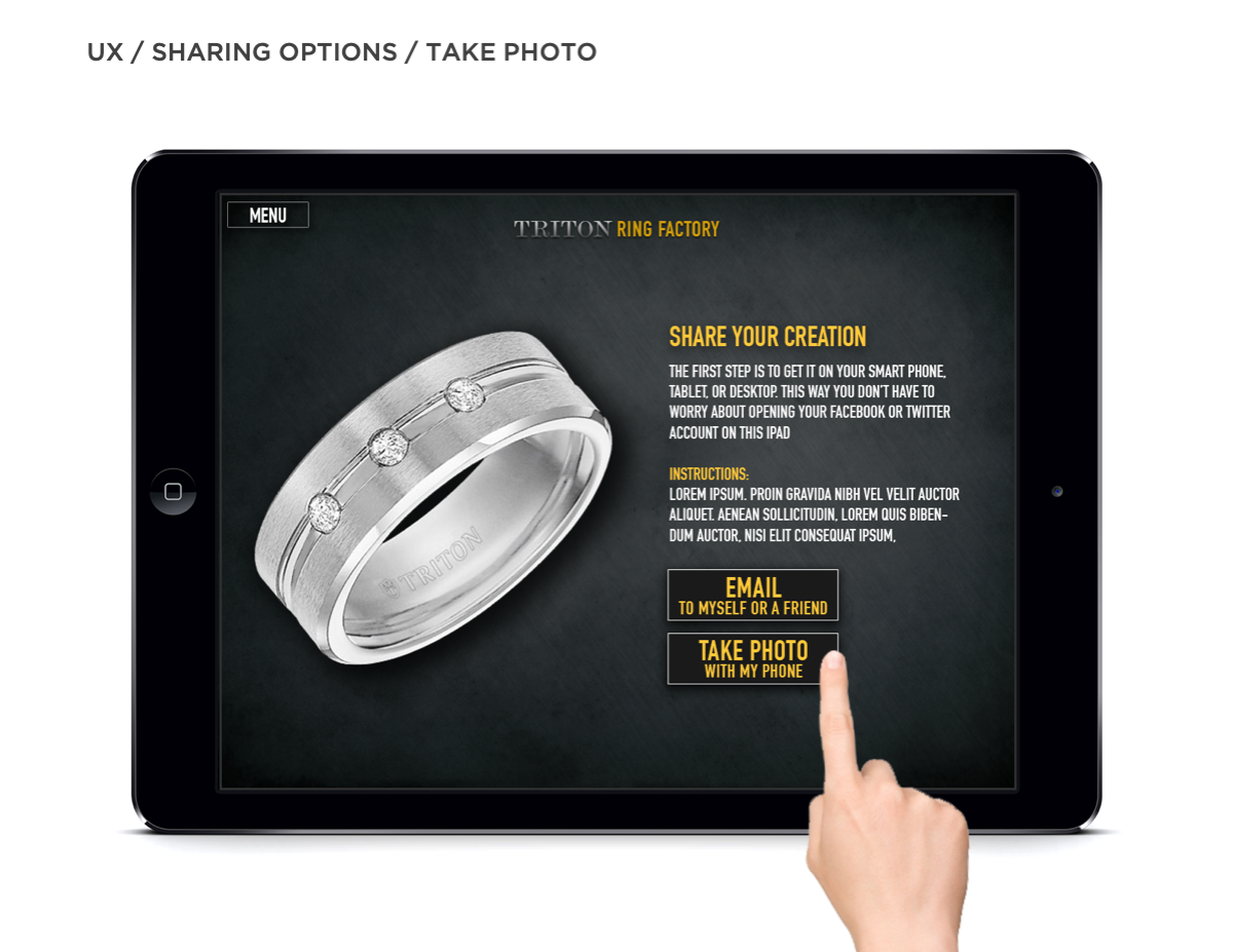
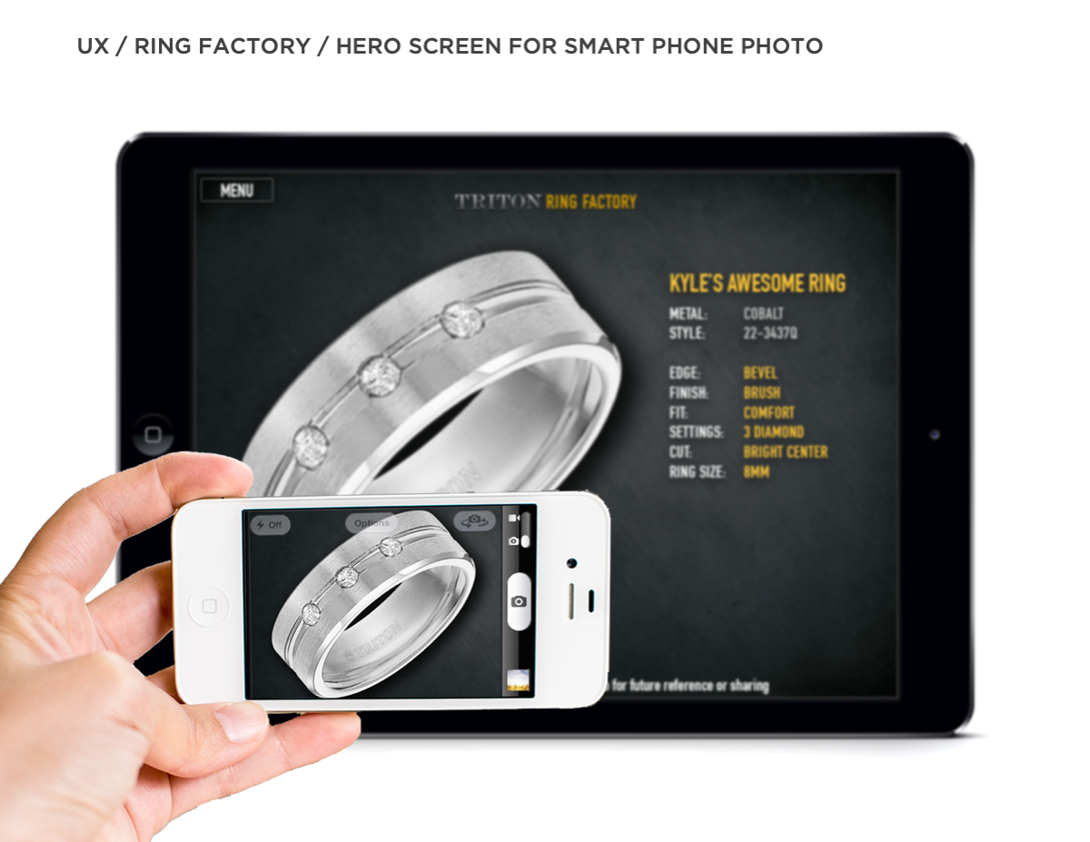
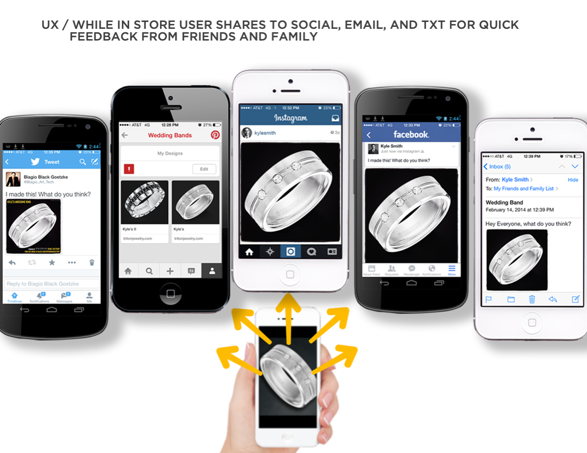
Of FGI’s brands, we selected Triton for the Ring Factory application. Triton is for men looking for creative, high-quality jewelry that fits their active, everyday lifestyle. We researched Triton’s past branding to discover what worked and what didn’t. We interviewed stakeholders at FGI to get further insight into the DNA of the product. We spoke with customers and jewelry store owners to understand what would motivate a customer to create their own custom Triton ring. We now had a clear picture of who the user would be and their needs. We did direct and indirect competitive research and looked at who was doing bespoke design best, such as Nike By You (Nike ID). To memorialize what we have learned so far, we created a Feature Set document. One of the features that stood out was the ability to share your design. We had discovered many users would want to be able to get feedback from friends and family before they committed to a purchase.
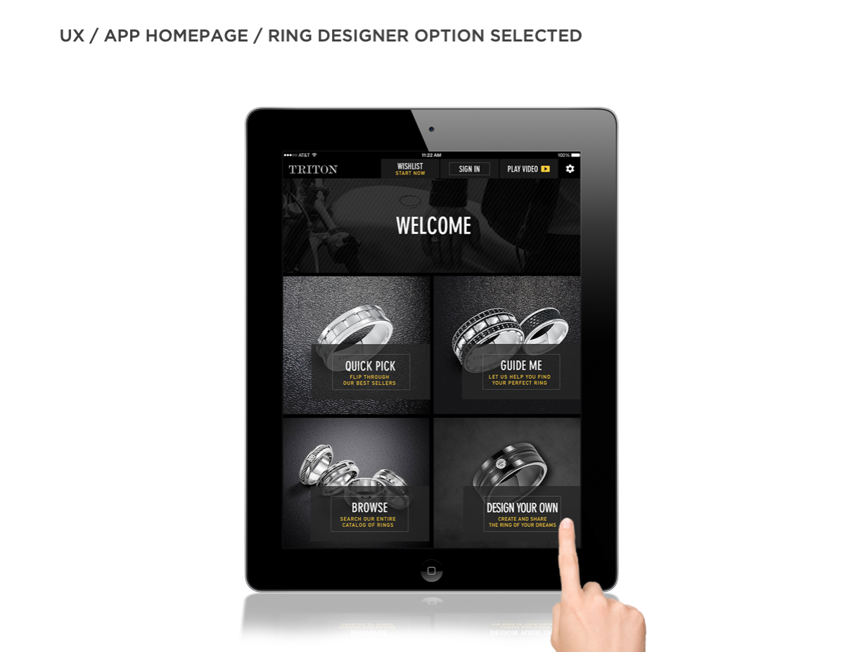
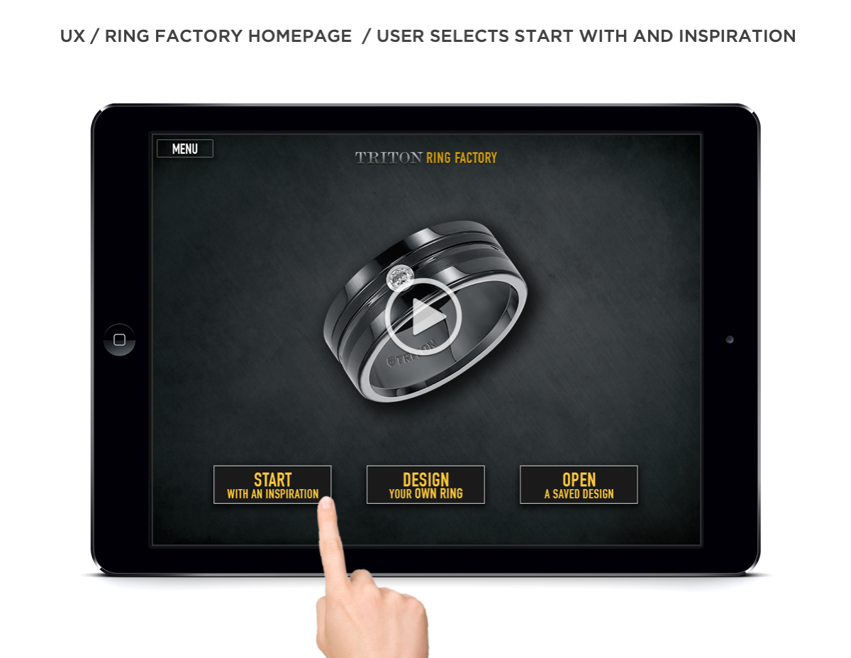
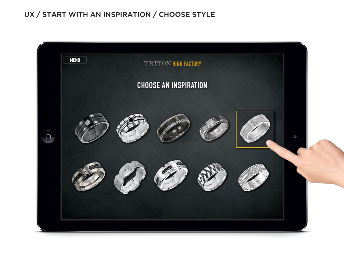
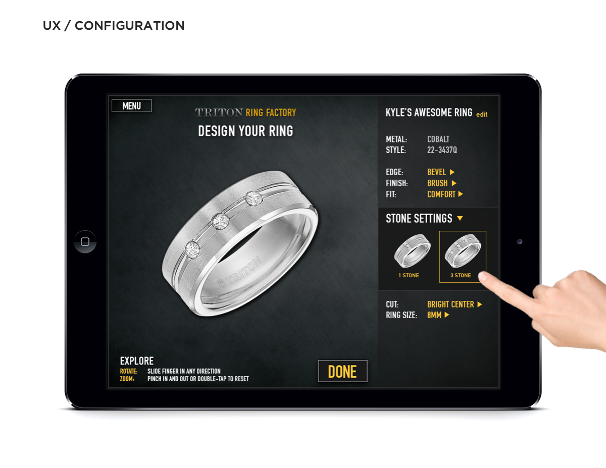
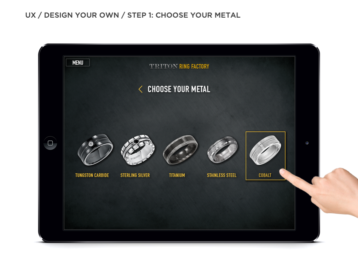
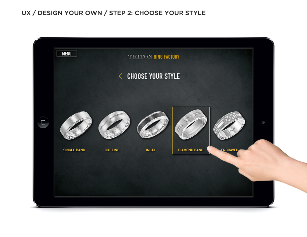
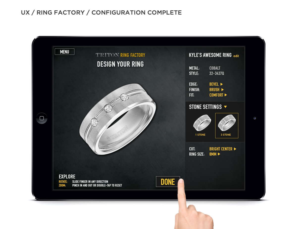
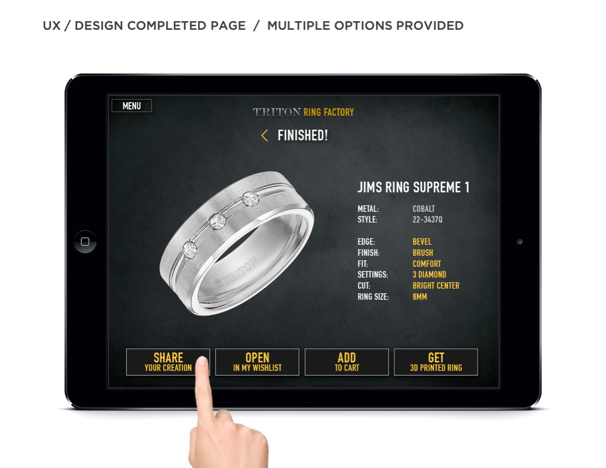
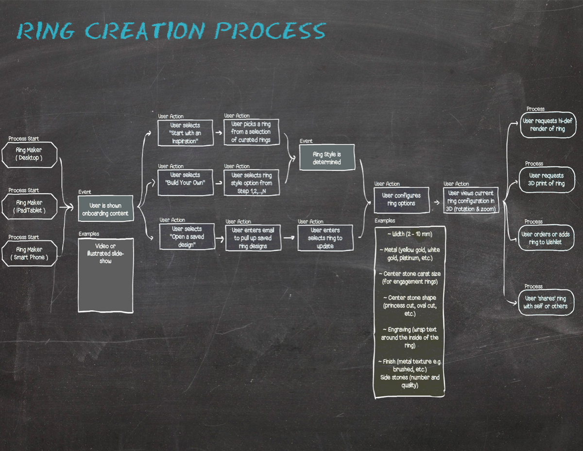
With the Feature Set in place, we sketched out rough wires on paper. Once the overall flow made sense, we moved to Visual Design. We knew the look and feel that would work for this masculine brand needed to have a polished yet industrial feel – tough with class. When we had the screens completed, we presented them to a small focus group to observe user interaction. We made needed iterations to address weak areas in the UX. The ready-design was shown to FGI and received approval.
RESULTS
We don’t have access to FGI’s analytics. However, the client was thrilled about the product.
Services
- Product Design
- Kiosk/App Design
- Interaction Design
- Visual Design
- Mobile Design
