Safety Awareness Game and Site
CLIENT
![]()
AGENCY

PLAY GAME
CHALLENGE
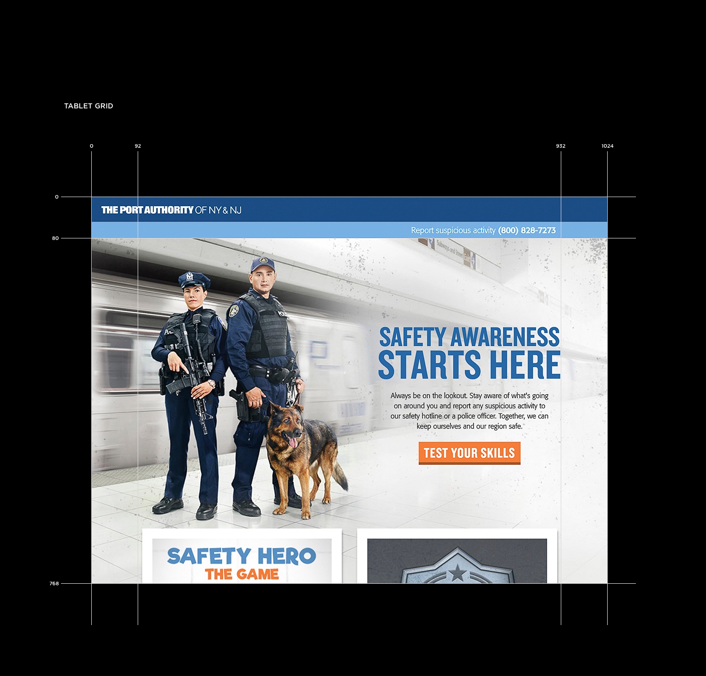
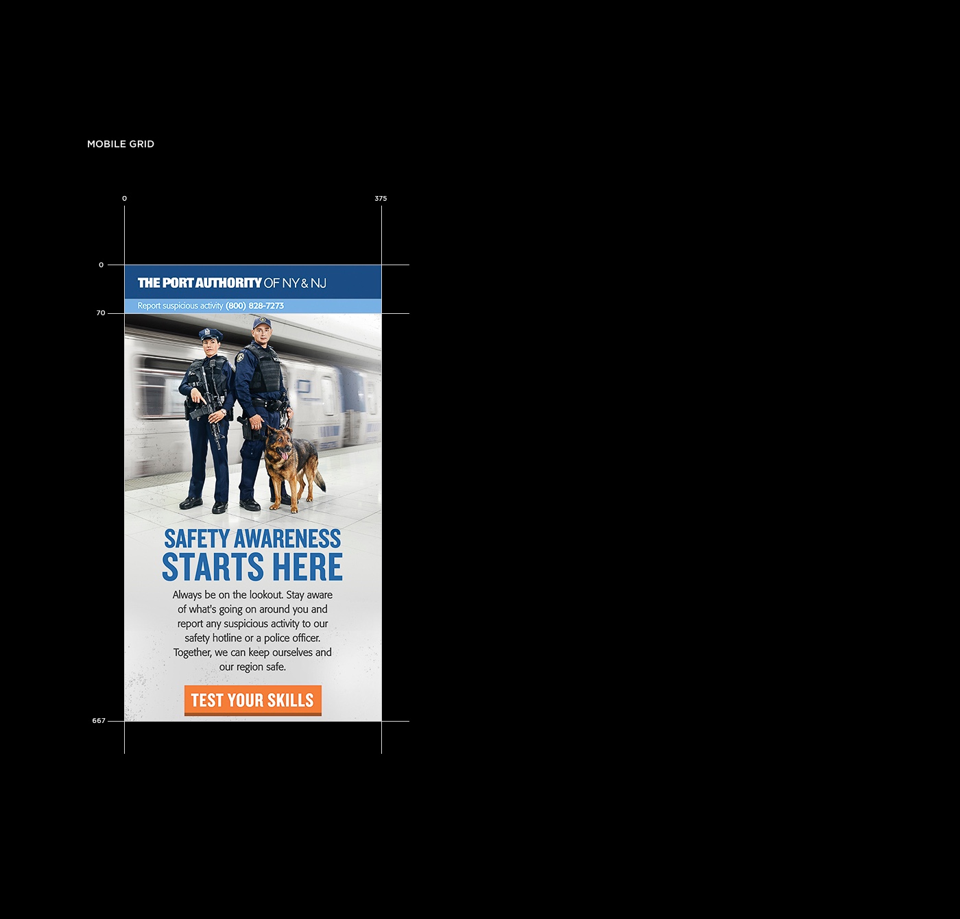
Create a captivating online destination for The Port Authority’s Safety First campaign that both engages and educates.
SOLUTION
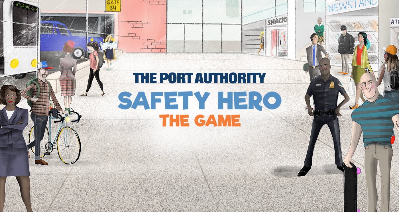
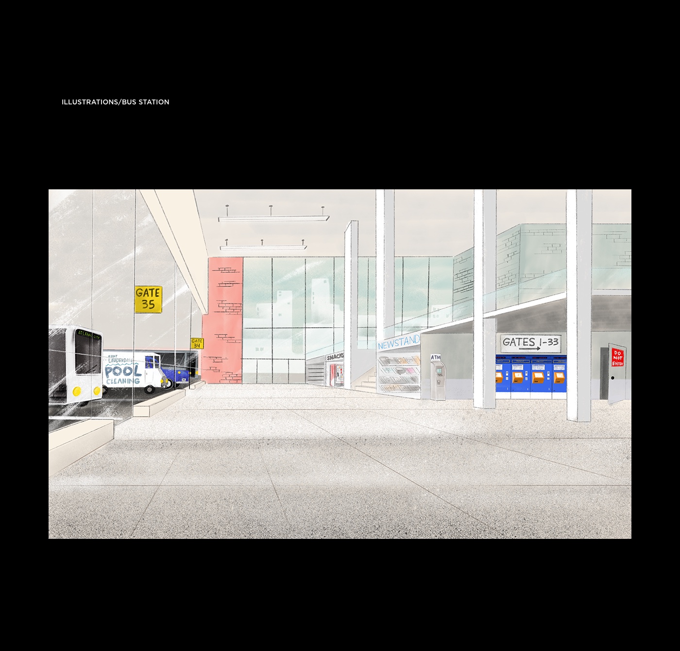
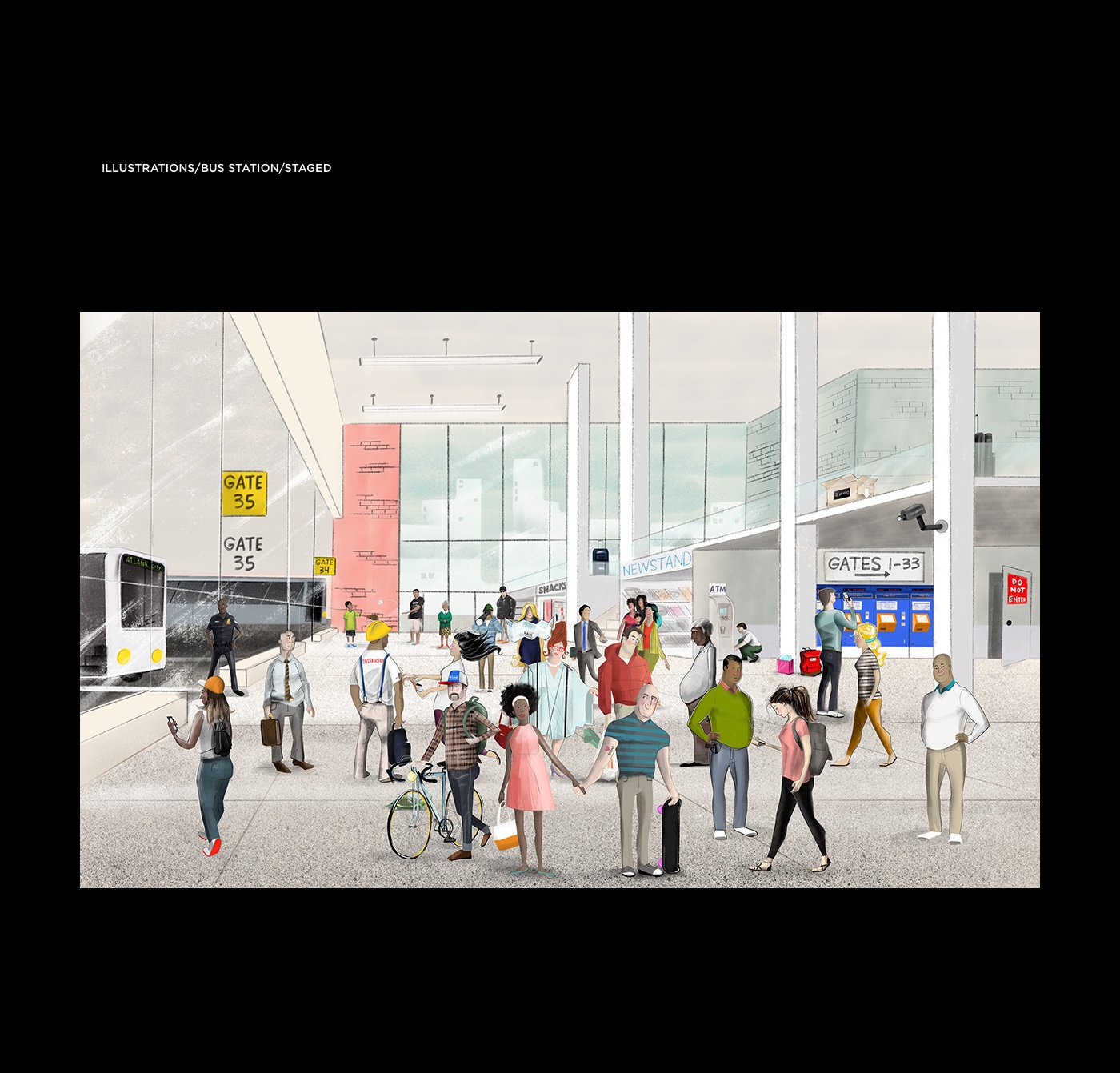
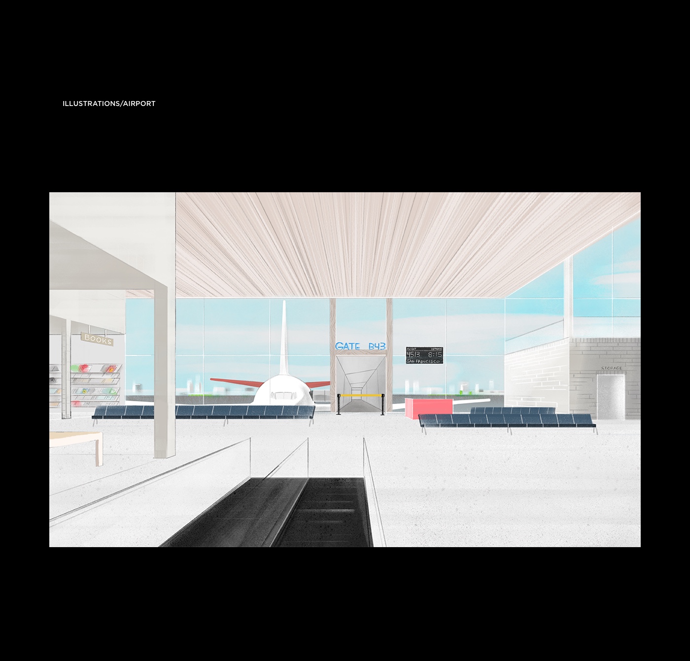
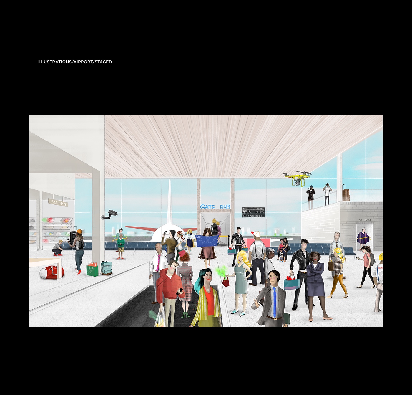
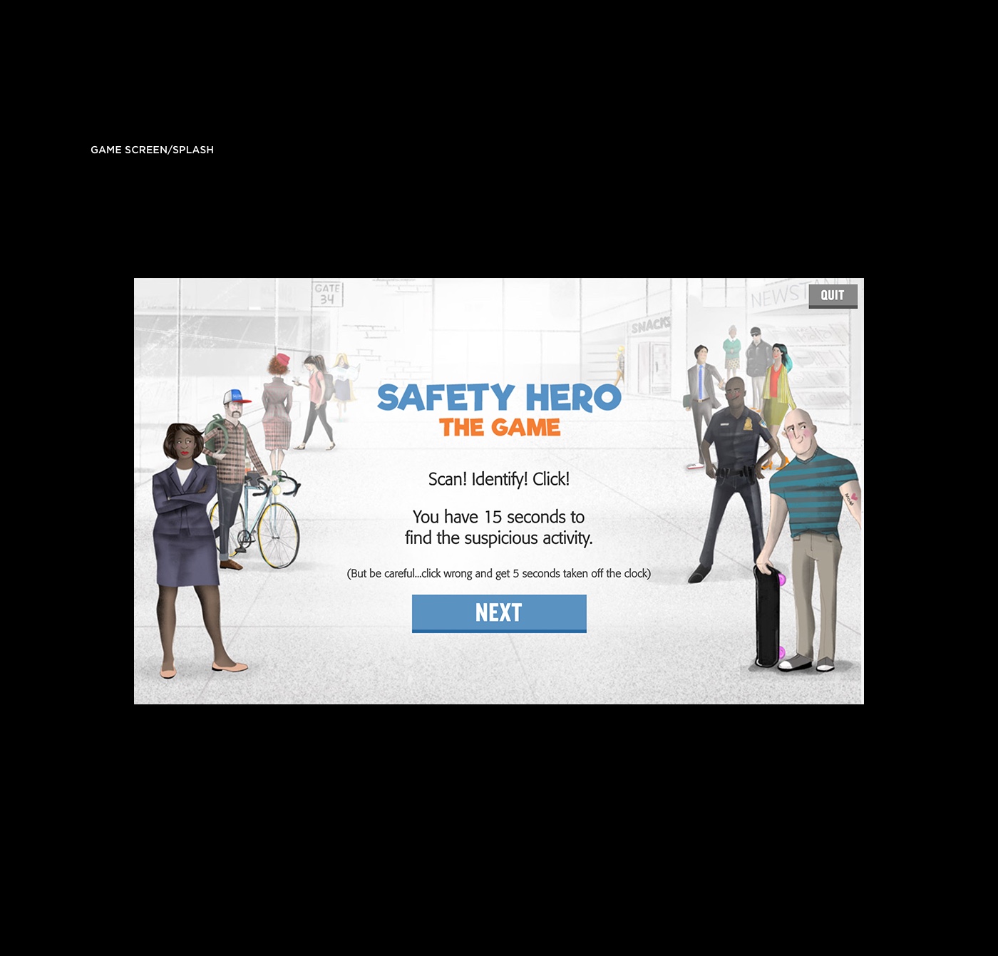
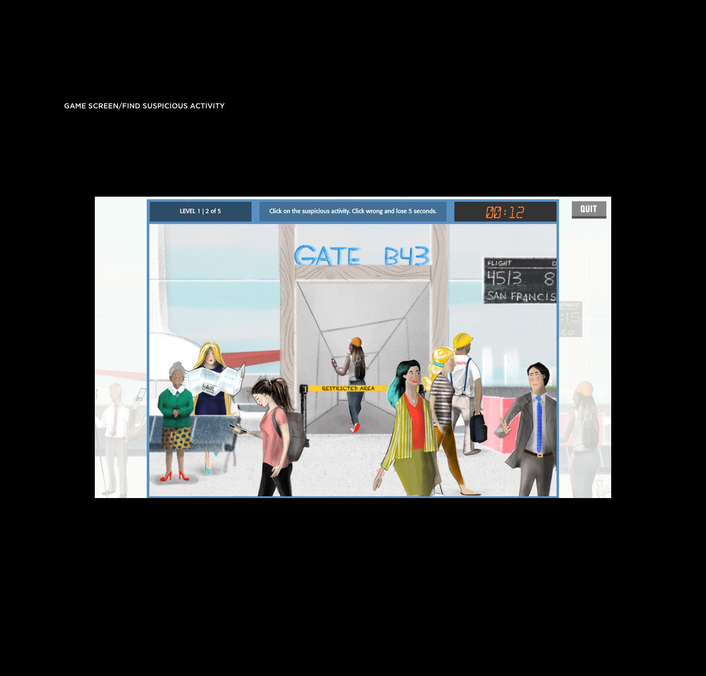
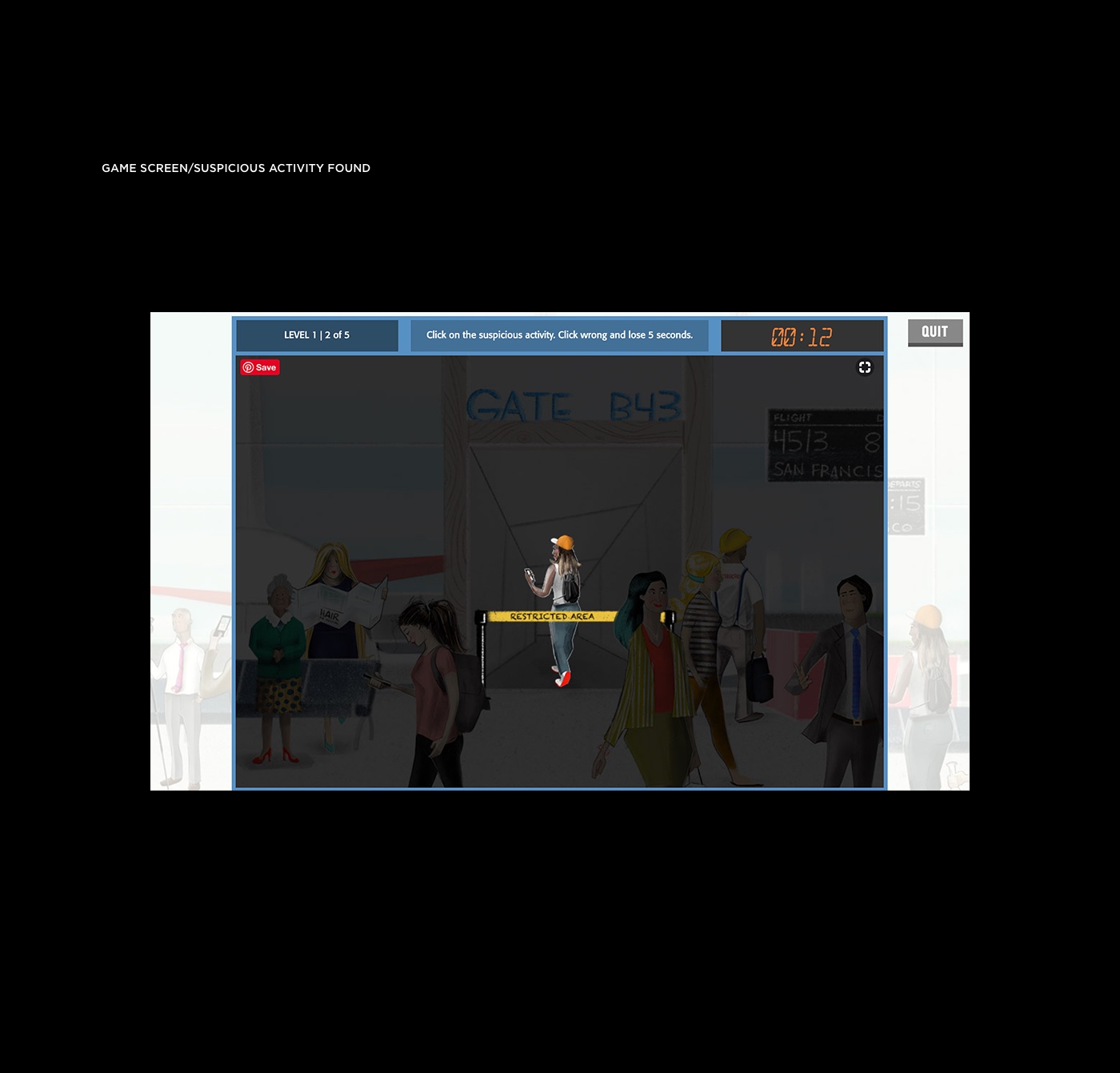
An immersive web game built for desktop and mobile that brings to life multiple environments with dangerous characters and situations using beautifully stylized illustrations. The user is challenged to identify suspicious activity before the clock runs out.
After discussing the ‘Big Idea’ with the client we saw a great opportunity to create something that is both fun and engaging while achieving the business goal of teaching safety. The first step was to fully understand what The Port Authority wanted to achieve with the Safety First campaign. The goal was for commuters to be informed on what is suspicious activity and to know how to report it to the nearest authority or call the dedicated 1-800 number. In addition, it was essential to get to know the user and their needs. After talking with as many potential users as possible it was clear we’d need to captivate the users’ limited attention if we expected them to stick around and learn. For inspiration, we scoured the web and app stores for entertaining games that involved learning. We didn’t find anything that was apples-to-apples but did discover some great approaches to exciting users. The biggest project constraints were time (as always) and the requirement of showing a non-trivial number of examples of suspicious behavior.
Now, armed with a deep understanding of the problem domain we were able to work out a great solution. We knew that we wanted to use Inductive Learning to train commuters to be aware of potential dangers. This demanded that the game teaches by showing examples of dangerous situations. The conclusion was to build a game that had users identify suspicious activity in the context of the environments (bus station, airport, subway) of common commuter travel. To give life to the game we cast a wide net to find a brilliant illustrator that could create engaging environments and characters. The game uses classic gamification strategy to drive engagement. It also includes socially sharable achievements to further awareness.
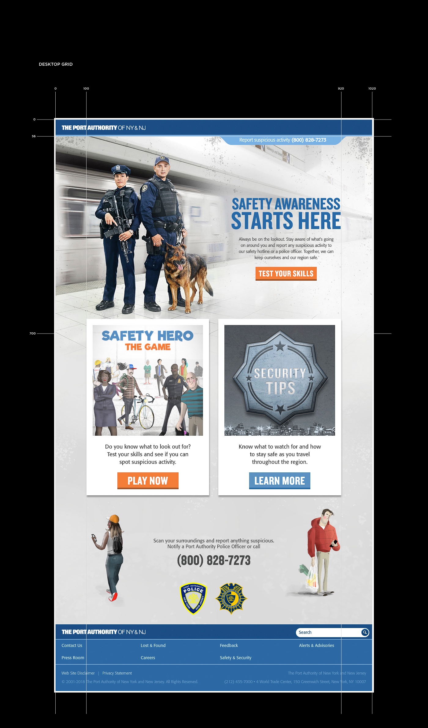
Although there was limited time and budget for user testing we continually tested the game and the website that housed it with participants from our friends and family network to make sure we were on the right track. Fortunately, everyone loved the gaming experience and updates to the UX were minimal.
RESULTS
The site remains a success year after year with solid engagement.
Services
- Product Design
- Game Design
- Interaction Design
- Illustration
- Visual Design
- Frontend Development
- Backend Development
