Goldman Jewelry Kiosk
CLIENT
![]()
ABOUT
Frederick Goldman (FGI) was founded in the late 1940s as a one-person operation specializing in plain wedding rings. FGI has grown to become one of the largest jewelry manufacturing companies in North America across three separate divisions serving all retail channels of distribution.
Modstar was brought in to develop the strategy, features, implementation, and design of FGI’s ring customization application.
CHALLENGE
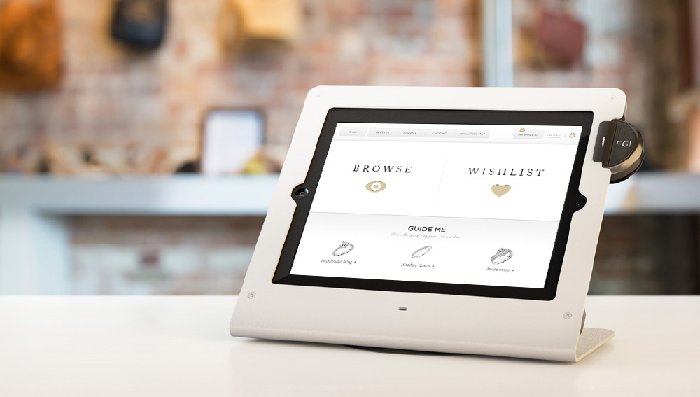
Create a portable kiosk for use in FGI’s partner jewelry stores for the Goldman jewelry line.
SOLUTION
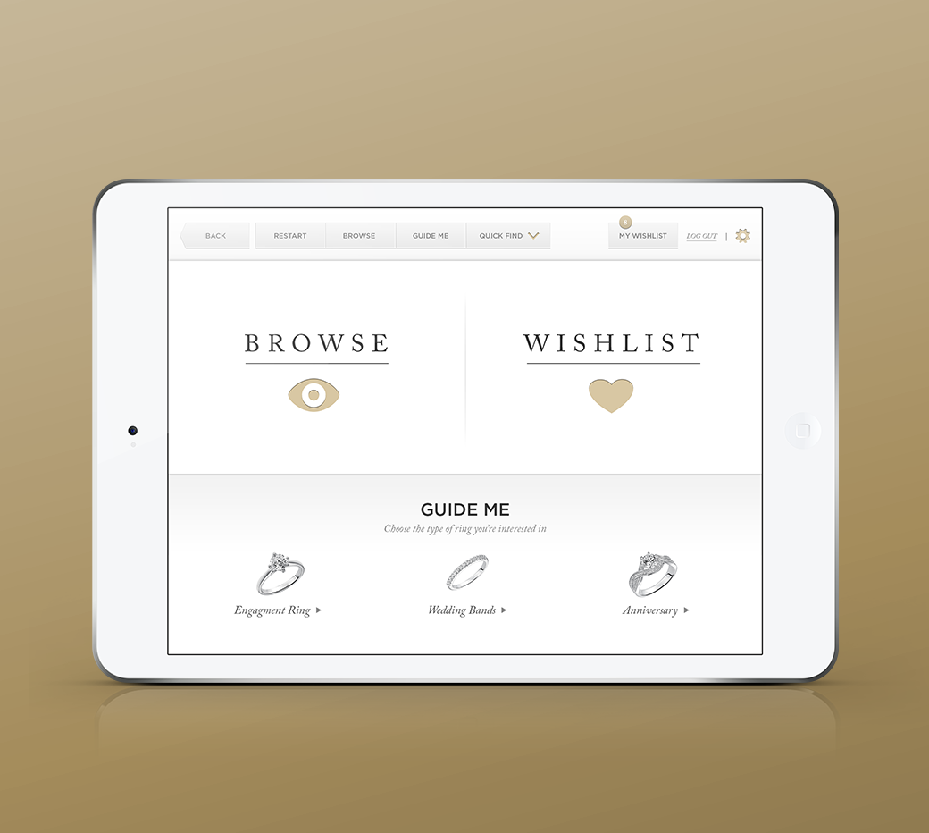
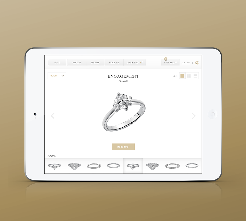
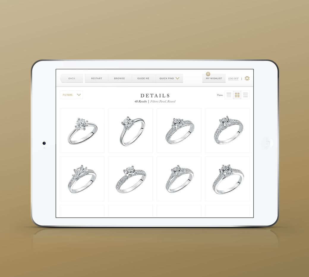
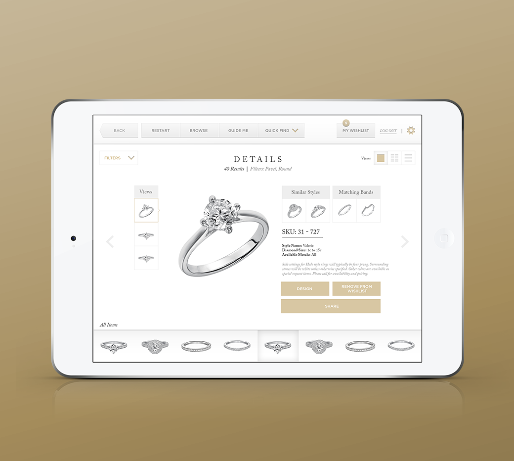
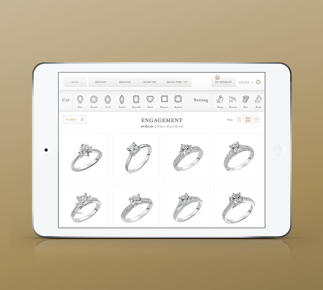
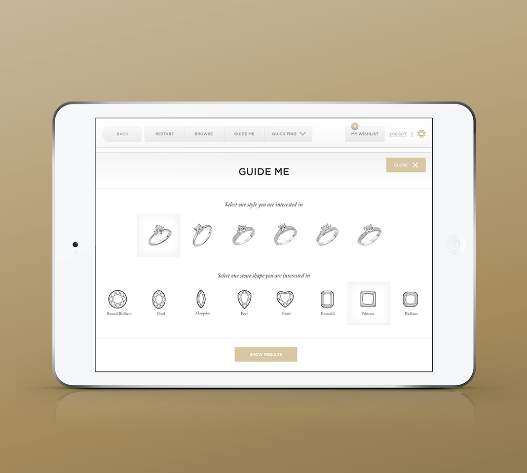
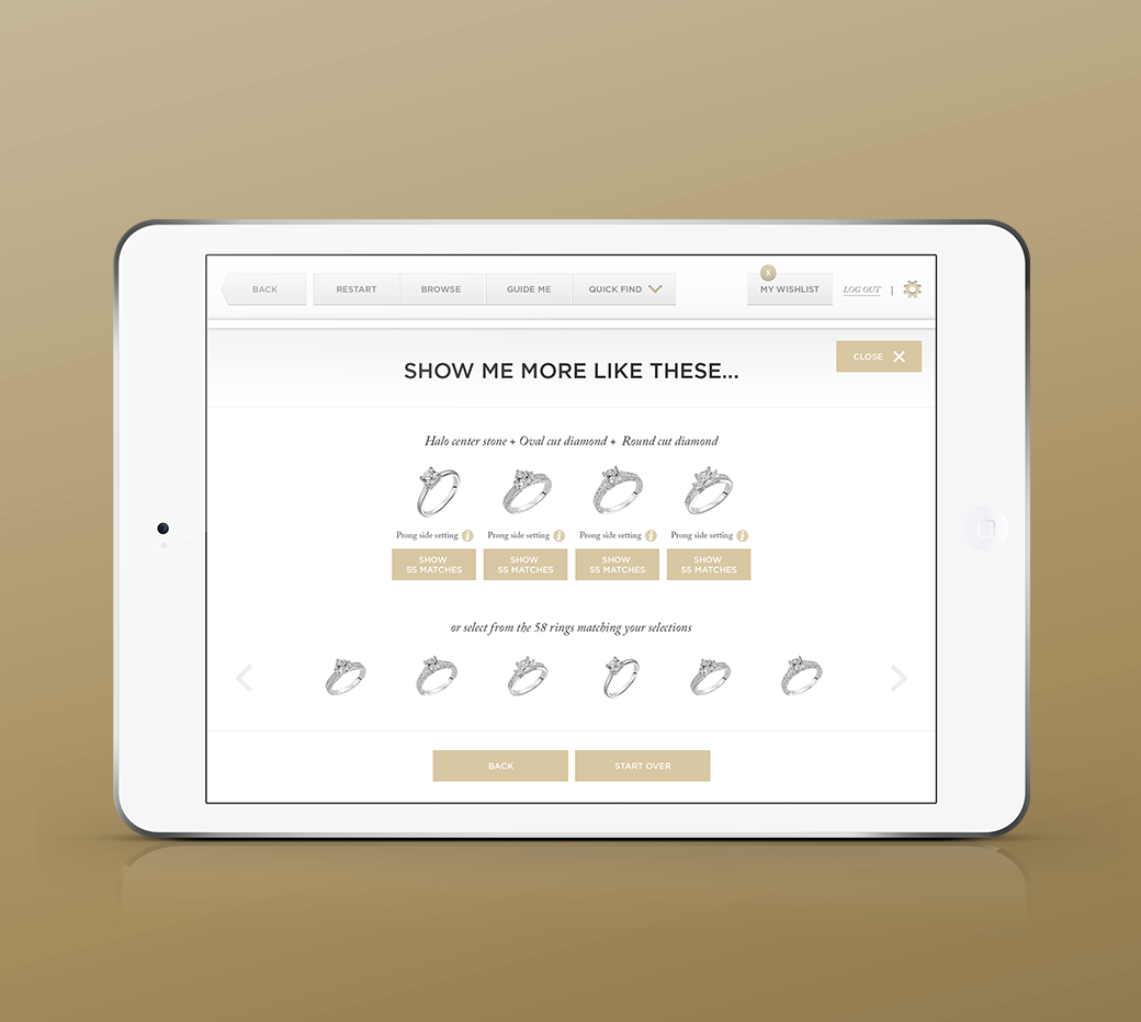
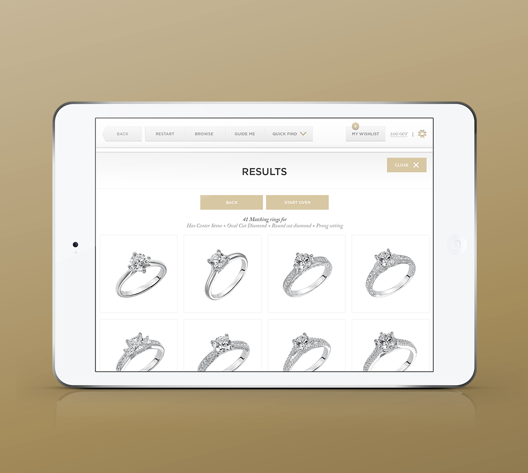
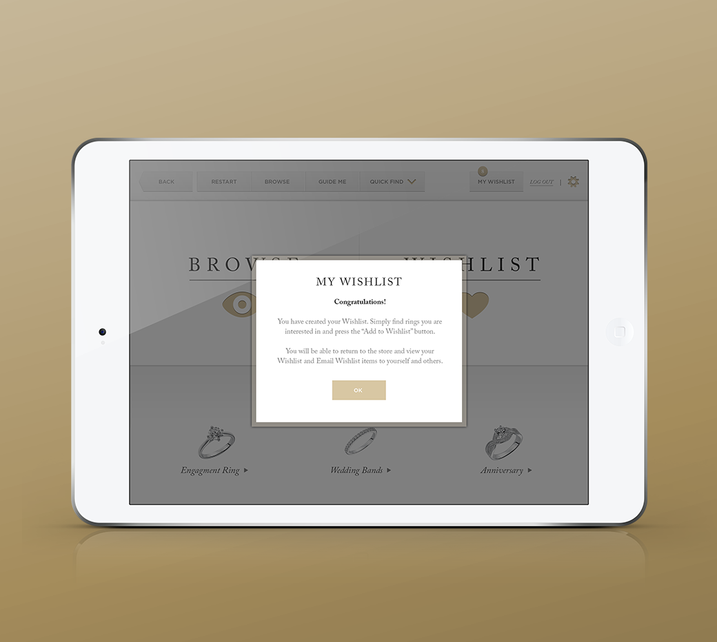
We did field research to get an understanding of context-of-use. We went to jewelry stores and interviewed owners and customers. Our fear was unless the proposed kiosk was found to be useful by both the shop owner and customers it would be placed on a shelf in the back and forgotten. What did it need to offer to be an essential sales tool kept ready-at-hand by salespeople? One of the many takeaways from this research was that customers return multiple times before purchasing a ring. Clearly, it would be helpful if the kiosk could remember the potential customer and items they liked. The Feature Set we created allowed users to make a Wishlist to review favorite rings when they return. It also had a Guide Me feature that would act as an expert recommendation engine by asking multiple-choice questions and then suggesting rings that match the user’s tastes. Because many people could use the kiosk, it had to be extremely easy to use and navigate. A conspicuous Restart button would be an important feature to allow anyone to pick up the application and start from the beginning.
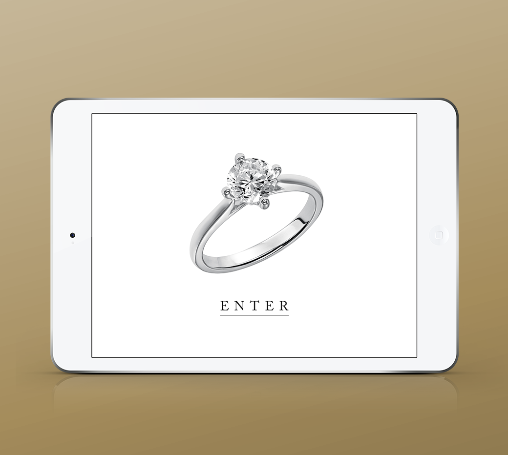
With the Feature Set in place, we sketched out rough wires on paper. Once the overall flow made sense, we moved to Visual Design. We knew the look-and-feel that would work for this brand needed to have a classic elegance with a touch of modernity. We chose typography and a color scheme accordingly. When we had the screens completed, we presented them to a small focus group to observe user interaction. We made needed iterations to address weak areas in the UX. The ready-design was shown to FGI and received approval.
RESULTS
We don’t have access to FGI’s analytics. However, the client was thrilled about the product.
Services
- Product Design
- App Design
- Interaction Design
- Visual Design
- Frontend Development
